General » Thumbnail images, cropped or with borders ?
Thumbnail images, cropped or with borders ?
Published 20/03/2012 @ 17:47:04, By antp
Following to comments made by 93montero, I launch this poll.
http://www.imcdb.org/vehicle.php?id=486804
http://www.imcdb.org/movie.php?id=43938
There was a similar one, years ago, which decided the current state.
Maybe people's taste changed? So let's ask again
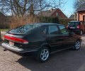
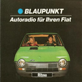
The problem with solutions 1 (current) & 2 is that in some cases a useful part of the image is missing, and if the car is only in the bottom or top of the picture it may even not be visible on the thumbnail.
The problem with solutions 2 & 3 is that black borders appear in non-2.35 images.
Examples
http://www.imcdb.org/vehicle_486888-Nash-Statesman-Super-5048-1950.html
1:

2:

3:

http://www.imcdb.org/vehicle_479151-Honda-Civic-1992.html
1:

2 & 3:

I can make other examples if you ask for a particular picture
http://www.imcdb.org/vehicle.php?id=486804
http://www.imcdb.org/movie.php?id=43938
There was a similar one, years ago, which decided the current state.
Maybe people's taste changed? So let's ask again

The problem with solutions 1 (current) & 2 is that in some cases a useful part of the image is missing, and if the car is only in the bottom or top of the picture it may even not be visible on the thumbnail.
The problem with solutions 2 & 3 is that black borders appear in non-2.35 images.
Examples
http://www.imcdb.org/vehicle_486888-Nash-Statesman-Super-5048-1950.html
1:

2:

3:

http://www.imcdb.org/vehicle_479151-Honda-Civic-1992.html
1:

2 & 3:

I can make other examples if you ask for a particular picture
Thumbnail images, cropped or with borders ?
Published 20/03/2012 @ 20:30:20, By owlman
How about this: keep the current aspect ratio, but regenerate the thumbnail centered around the car location coordinate (often already set by the user during vehicle add/edit).
This way you avoid black bars but still capture the car if it is at the top or bottom of the frame.
Latest Edition: 20/03/2012 @ 20:31:20
This way you avoid black bars but still capture the car if it is at the top or bottom of the frame.
Latest Edition: 20/03/2012 @ 20:31:20
Thumbnail images, cropped or with borders ?
Published 20/03/2012 @ 20:49:51, By chicomarx
I'd vote 3 but I don't understand the black borders. Can't the thumbnail just be a miniature without borders? On photobucket, if you post a movie poster you get a tall narrow thumbnail, with options 1 & 2 you'd only see half of it.
That makes them different sizes but in comments it doesn't really matter much.
That makes them different sizes but in comments it doesn't really matter much.
Thumbnail images, cropped or with borders ?
Published 20/03/2012 @ 21:03:11, By antp
@owlman > It is on my to-do list (it is a little more difficult to do  )
)
but it still does not help if the car is not "marked" on the image or if the car is big but ends up partially cut (cf first example, where you would not mark the car)
@chicomarx > If all thumbnails have the same size, I must either crop a part or add borders. I find that much better looking if all have the same size.
Of course usually different ratios are not mixed, but:
- it is the same system used for main vehicle images and extra comment images
- for main vehicle images, different sizes of pictures are mixed in vehicles lists, so there I can't do like photobucket with their variable-ratio thumbnails.
Latest Edition: 20/03/2012 @ 21:03:44
 )
)but it still does not help if the car is not "marked" on the image or if the car is big but ends up partially cut (cf first example, where you would not mark the car)
@chicomarx > If all thumbnails have the same size, I must either crop a part or add borders. I find that much better looking if all have the same size.
Of course usually different ratios are not mixed, but:
- it is the same system used for main vehicle images and extra comment images
- for main vehicle images, different sizes of pictures are mixed in vehicles lists, so there I can't do like photobucket with their variable-ratio thumbnails.
Latest Edition: 20/03/2012 @ 21:03:44
Thumbnail images, cropped or with borders ?
Published 20/03/2012 @ 21:10:57, By Sandie
So main image thumbnails on the movie page will be affected too by the decision here?
Thumbnail images, cropped or with borders ?
Published 20/03/2012 @ 21:18:48, By antp
Yes (well, I could manage them separately, but I do not really see the point of that)
What I could also do is to use 1.85 ratio for thumbnails, but then 2.35 images would get horizontal black borders.
What I could also do is to use 1.85 ratio for thumbnails, but then 2.35 images would get horizontal black borders.
Thumbnail images, cropped or with borders ?
Published 20/03/2012 @ 21:33:57, By owlman
@owlman > It is on my to-do list (it is a little more difficult to do  )
)
but it still does not help if the car is not "marked" on the image or if the car is big but ends up partially cut (cf first example, where you would not mark the car)
 )
)but it still does not help if the car is not "marked" on the image or if the car is big but ends up partially cut (cf first example, where you would not mark the car)
But that one could be marked purely to fix the thumbnail. Instead of complaining about the thumbnail "window" position, the user could mark it to fix it. (of course, an admin has to do this for existing cars...)
Like you said there are still cars that won't fit in the thumbnail, but I think that looks better than black borders. Although, in the very dark examples you gave the black borders are not so noticeable

Thumbnail images, cropped or with borders ?
Published 20/03/2012 @ 22:04:26, By Neon
Honestly I like it as how is now... In any case you always have to open the thumb for see the image in original size, so why modify it?
Thumbnail images, cropped or with borders ?
Published 20/03/2012 @ 22:14:36, By antp
But that one could be marked purely to fix the thumbnail. Instead of complaining about the thumbnail "window" position, the user could mark it to fix it.
Sure

 Search
 List of Categories
 Who has read this topic?
 Add Reply
 Printable version
 Activate notification


